Begin with meaning.
A recognizable identity starts with a clear idea, not a decorative gesture.

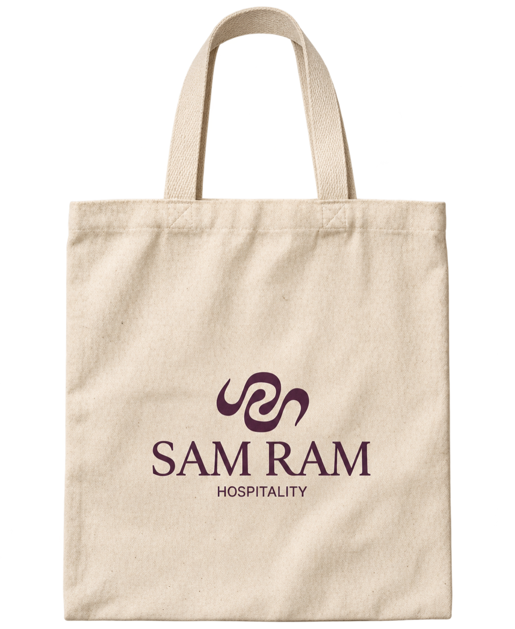
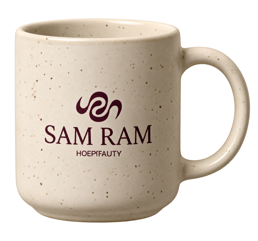

A brand identity is more than a logo. This project explores how a brand's character can be translated into a cohesive visual system, from typography and color to the finer details that create a recognizable identity.
A recognizable identity starts with a clear idea, not a decorative gesture.
Color, typography, form, and material are designed to work as one visual language.
The system earns its strength across real objects and moments of experience.
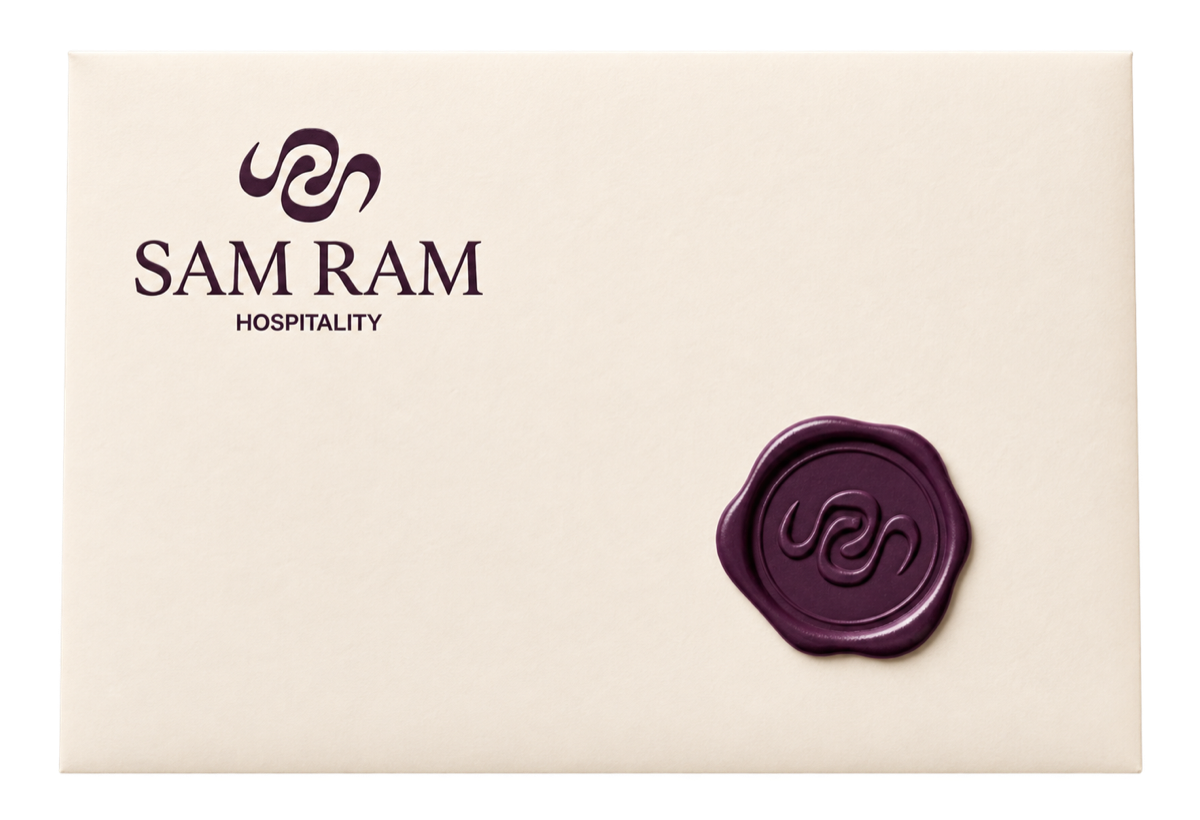
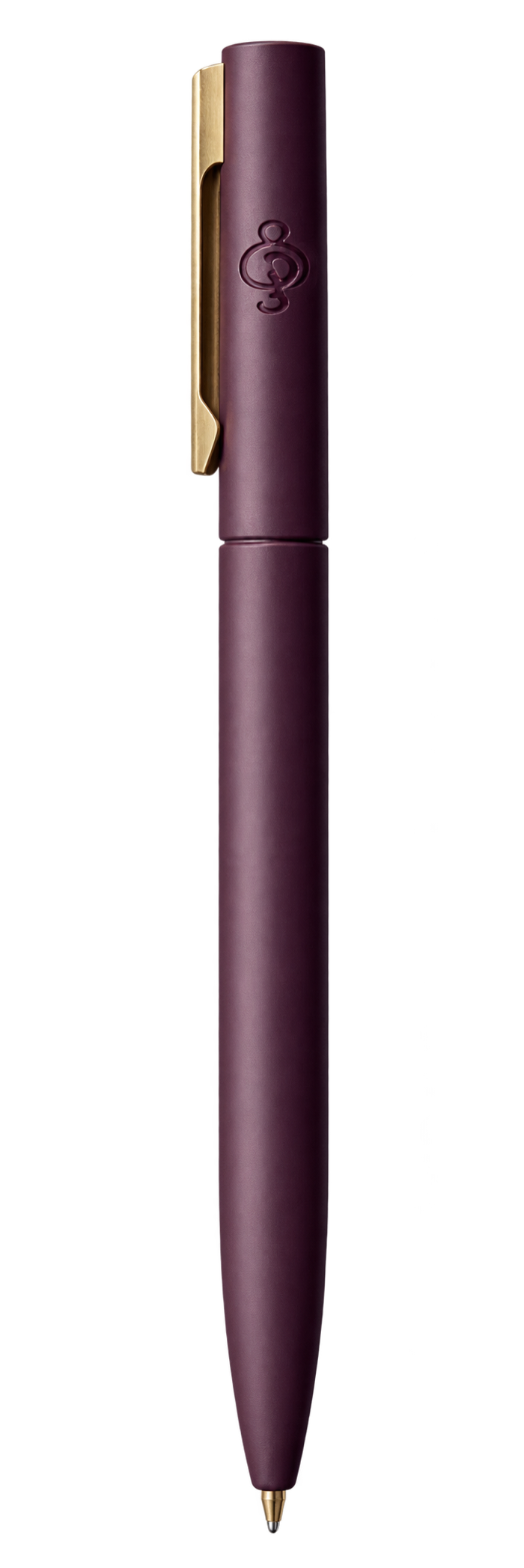
An interlocking mark expresses balance, togetherness, and wellbeing. A refined serif wordmark gives it calm authority; purple, yellow, terracotta, and cream keep the system warm and human.

Two letterforms are abstracted into a continuous relationship—distinct parts becoming one memorable symbol.
Letterhead, cards, writing tools, and envelopes use scale and restraint to keep every interaction coherent.
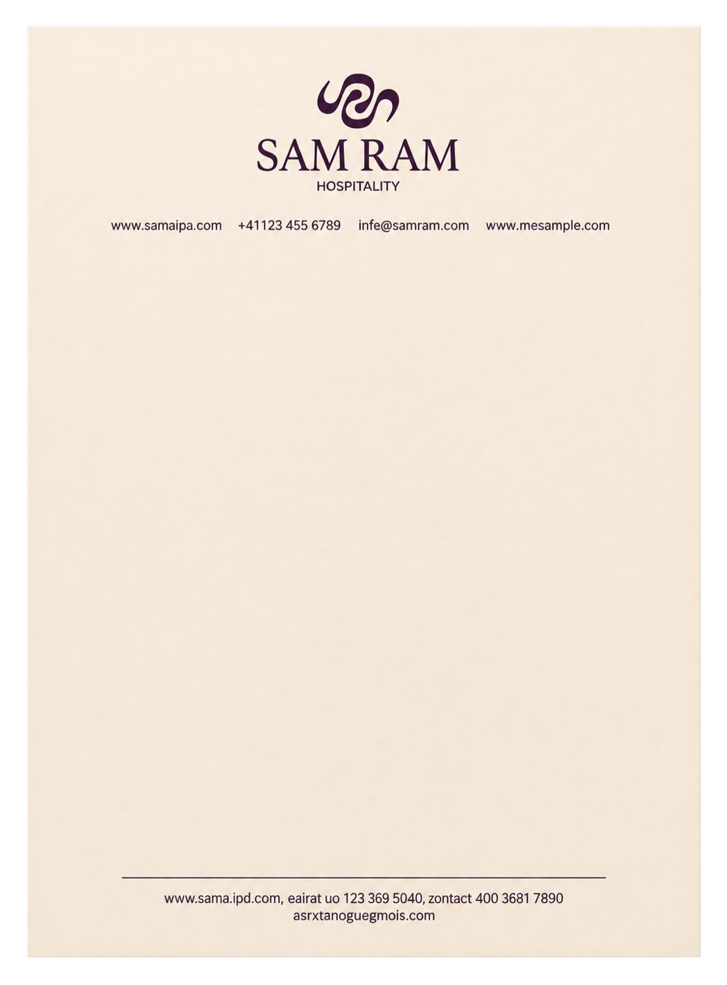
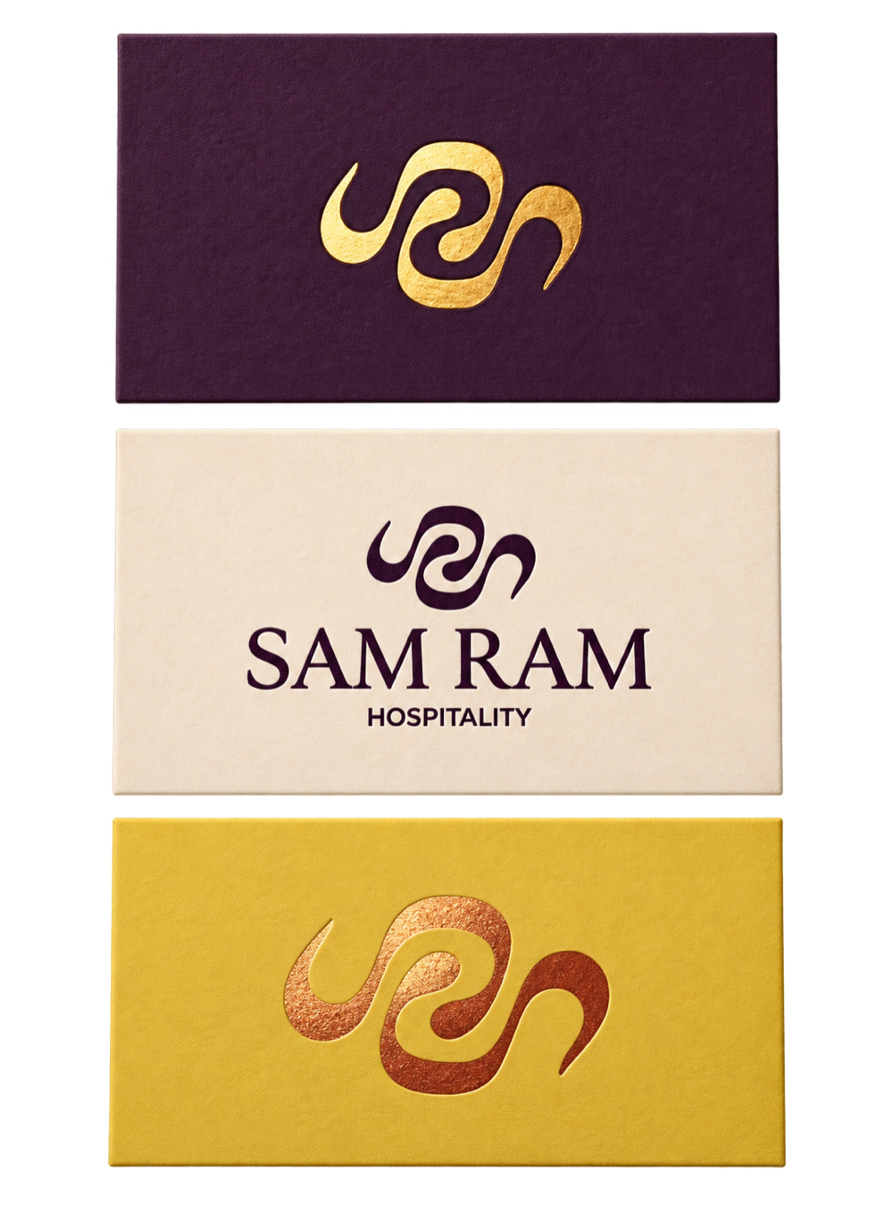
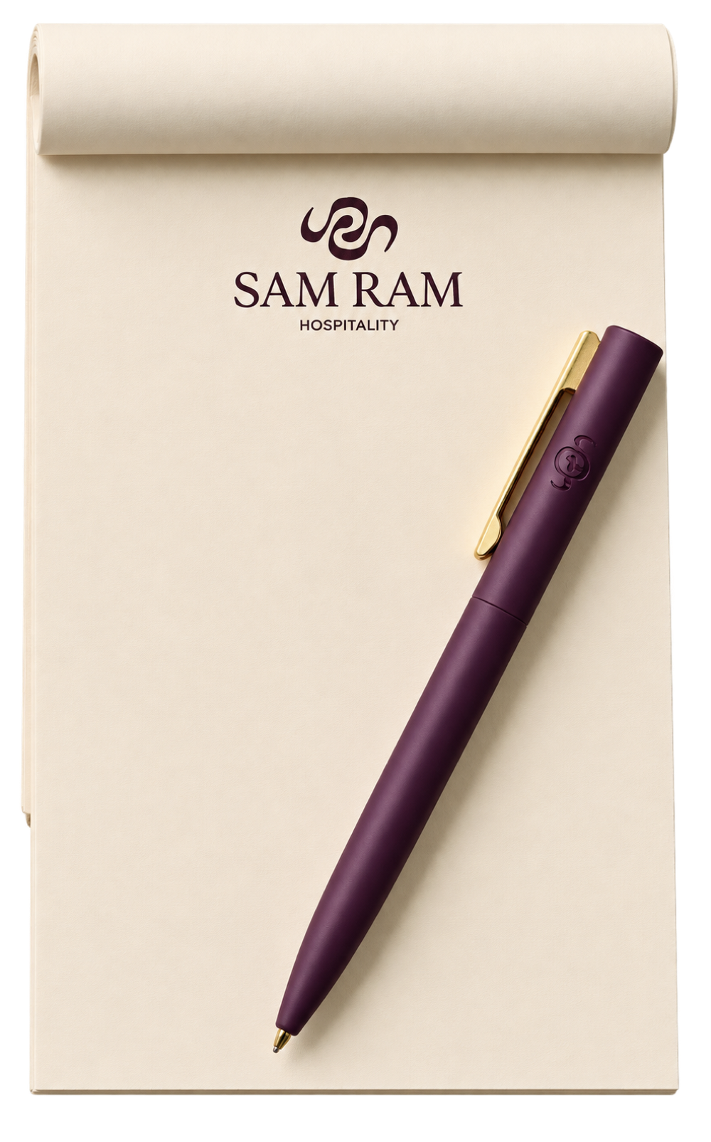
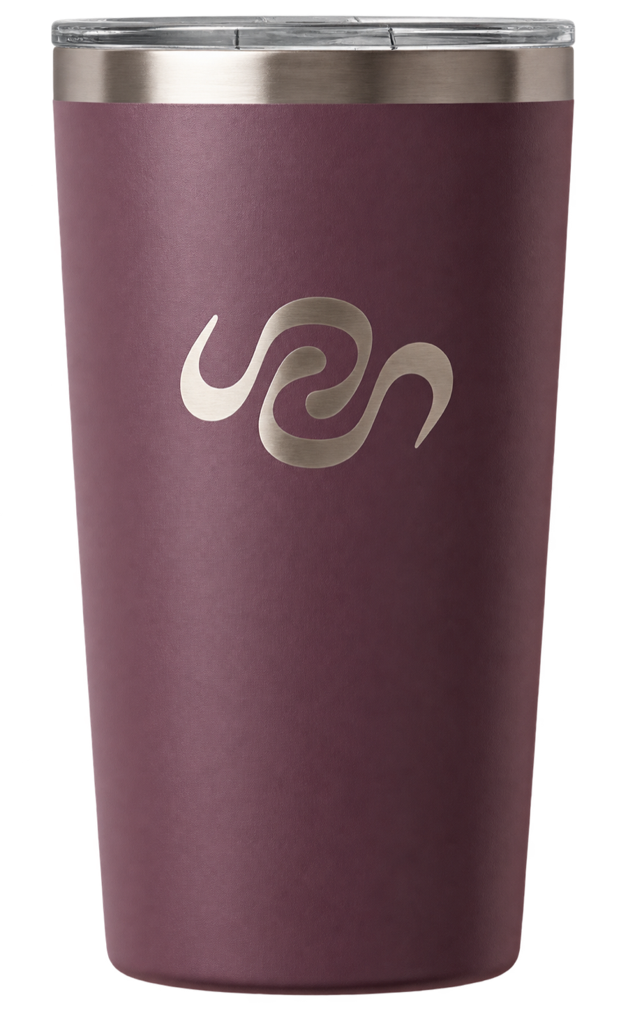
The mark stays recognizable across soft textiles, ceramic, metal, and print—while each object keeps its own material character.

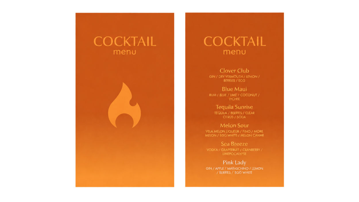
A flame and vessel combine into a mark rooted in warmth, craft, and celebration. An orange-to-amber spectrum brings energy; cream and near-black create the contrast needed for a refined hospitality setting.
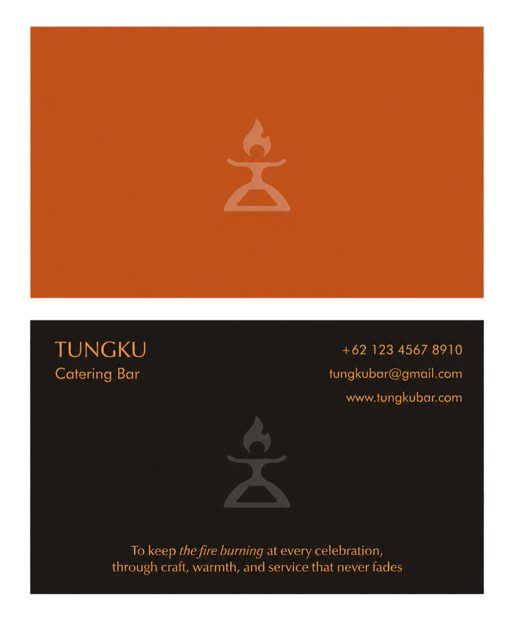
The symbol is designed to work as a bold signature on small objects, service materials, and staff touchpoints.
Barware concepts explore how the identity can extend into the ritual of preparation, presentation, and service.



Menus, cards, and cups carry the system from first impression through the guest experience.
High-contrast colorways make the identity visible in motion while keeping staff presentation simple and consistent.


Two identities, each with its own voice—both designed as living systems that can grow across every brand encounter.