Graphic Design

Designed toGet Noticed.

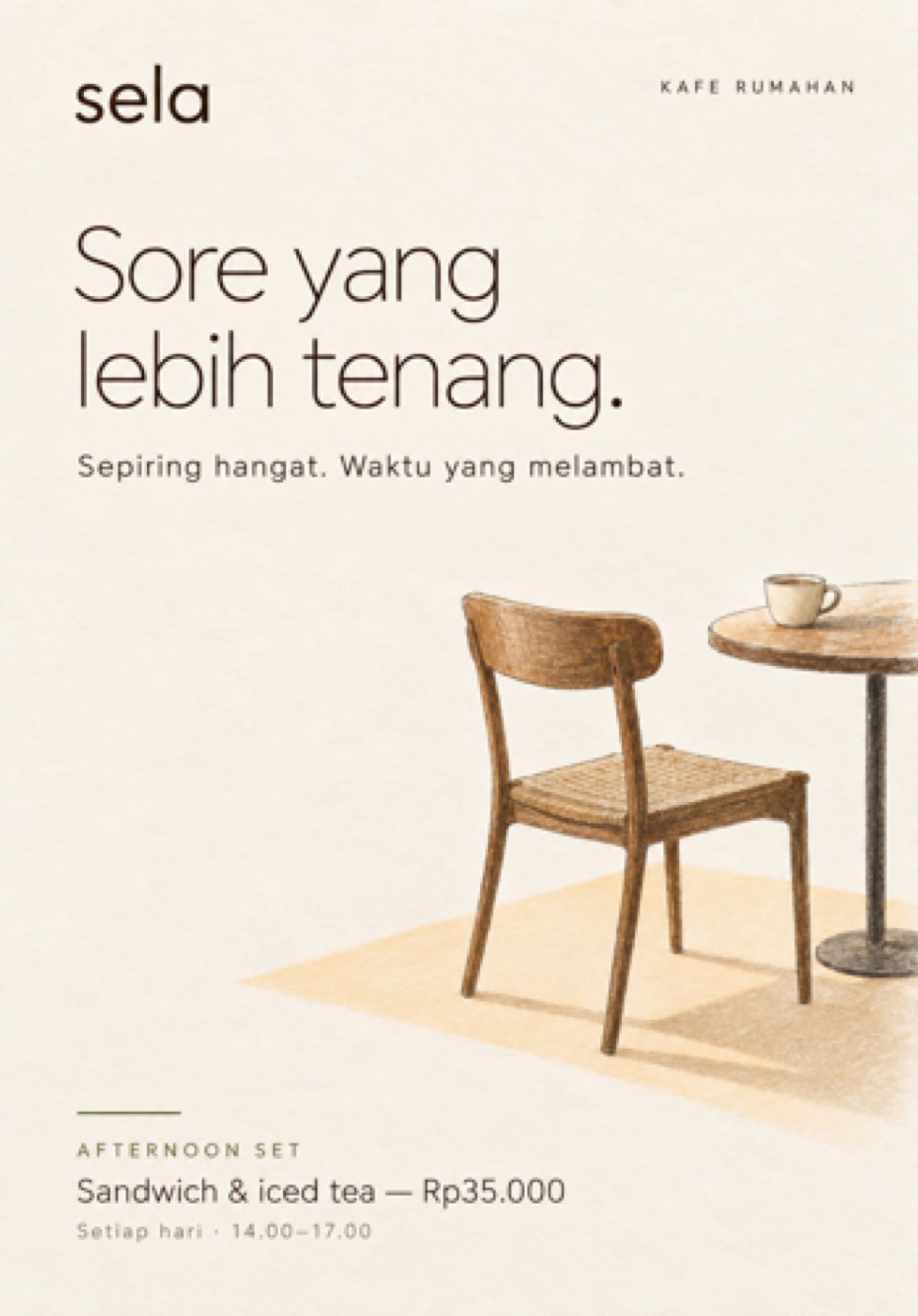
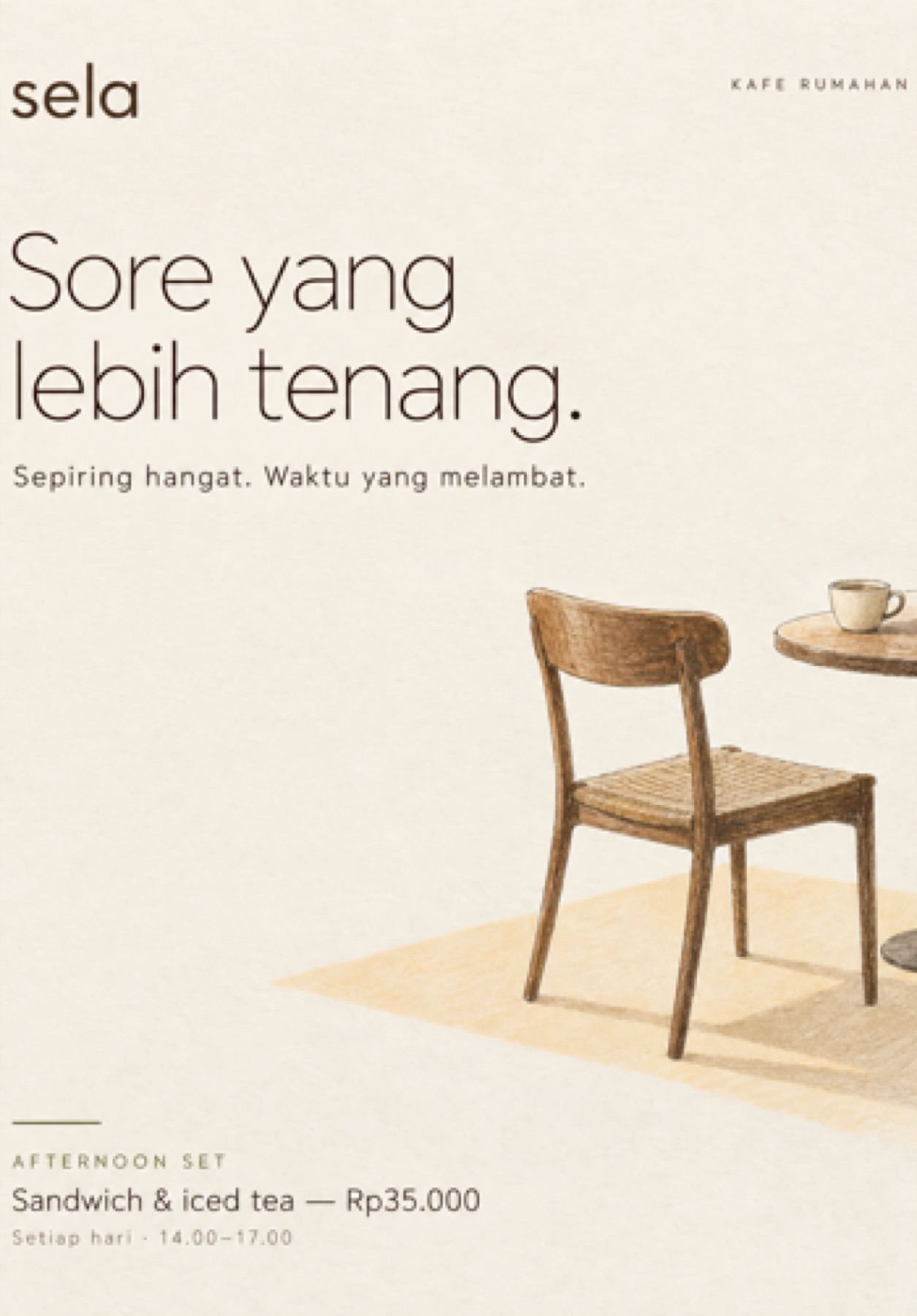
Editorial promotional layout with clear typographic hierarchyPromotional poster pairing a quiet message with natural imageryWarm promotional layout designed to stop attention
04 / 08
The project

A moment to be understood.

Flyers and posters often have only a moment to capture attention. This project focuses on the relationship between layout, typography, imagery, and hierarchy to communicate the message clearly while maintaining the brand's visual character.

Category
Graphic Design
Focus
Message · Hierarchy · Brand Recognition
Creative Philosophy

Clarity earns attention.

Minimal promotional layout with a dominant headline
The headline receives the first read; supporting details follow without competing for attention.
01

Lead with the Message

Essential information is prioritized so the audience understands the offer before needing to search for it.

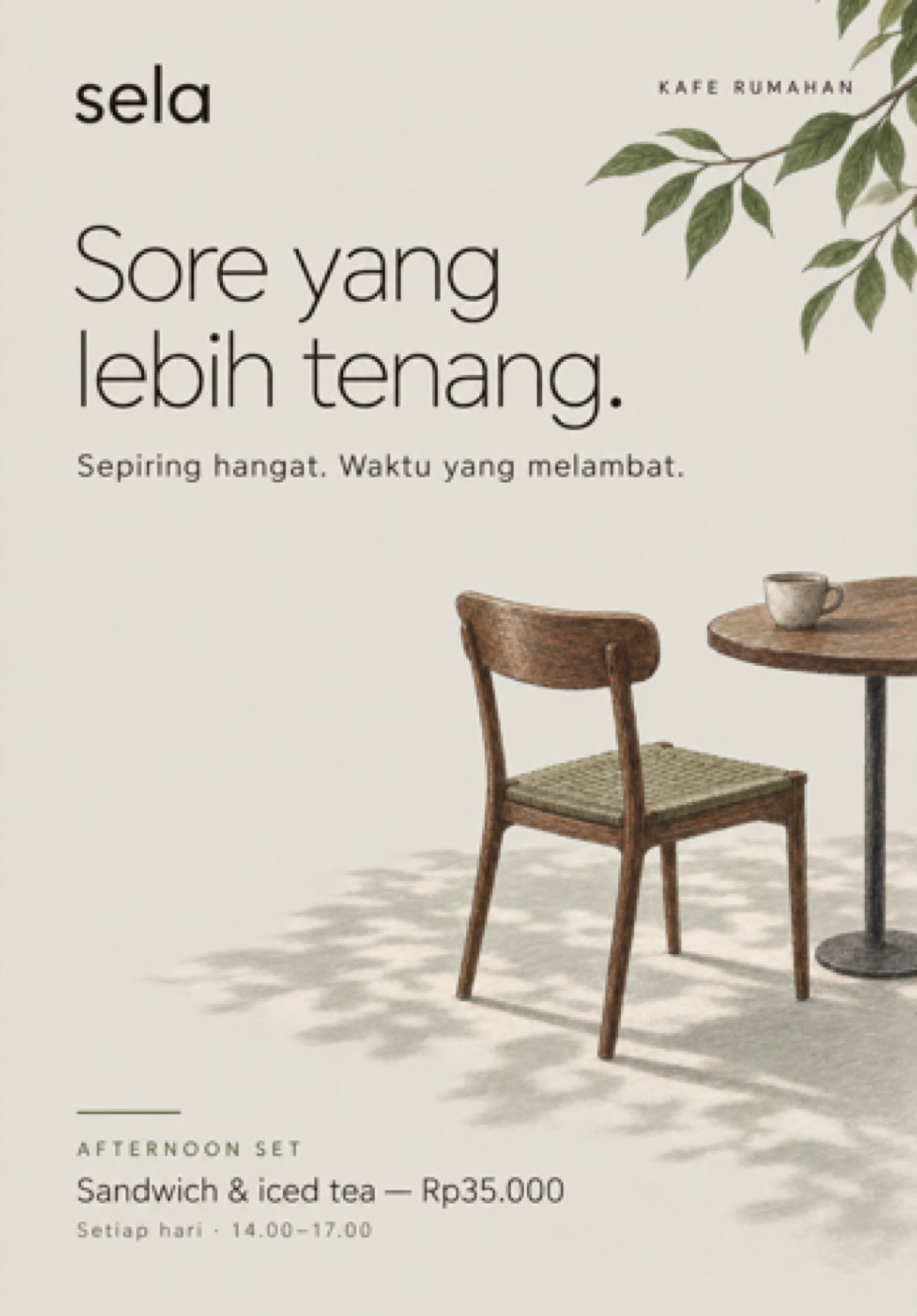
Promotional layout using negative space around the key message
Negative space gives the message room to land while the image supplies mood and context.
02

Make Space Work

Composition and spacing guide the eye deliberately, turning empty space into part of the communication.

Campaign poster with consistent typography and palette
Typography, palette, and image treatment remain recognizably connected across the series.
03

Keep It on Brand

The layout changes with the message, but the visual identity remains coherent across each touchpoint.